June 10, 2016

Logo Designers create Logos keeping in mind not just a fantastic design but also many other things associated with a brand. Let’s look at some of the best logos created over time along with the hidden message behind them.
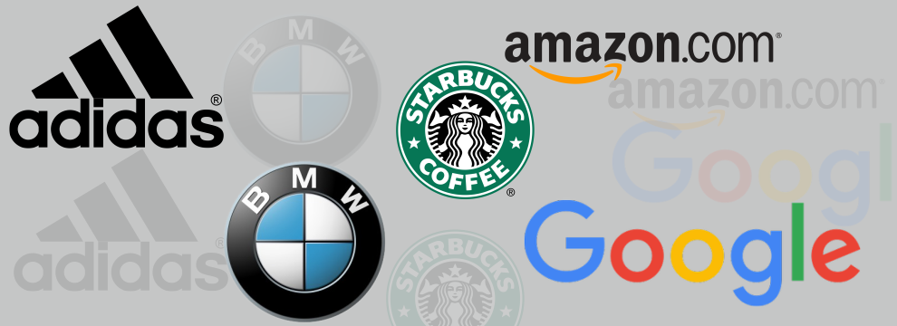
Adidas
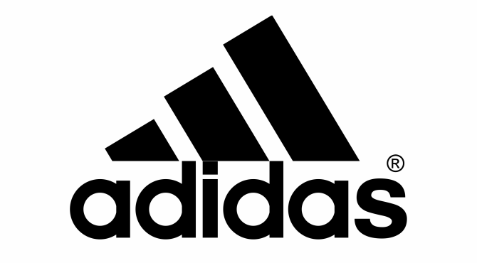
Hidden Message: Conquering the mountain
Initially, the simple three-stripe logo of Adidas didn’t have much meaning behind it. But later it was further tweaked to change into the shape of a mountain peak. It represent the struggles that athletes must endure to achieve greatness.
Amazon

Hidden Message: Everything from A to Z
At first look you will only see a smiling face on the Amazon logo. But this smiling face depicts more than just the happiness and positive connotation associated with the brand.
The subliminal message in the shape of arrow points from alphabet A to Z saying that Amazon deals in anything and everything.
BMW
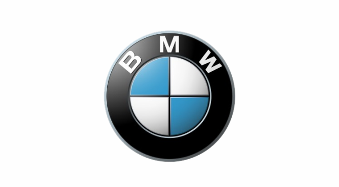
Hidden Message: The accidental propeller
Long time ago, BMW wanted to use the colors of the Bavarian Free State in their logo, but since it was illegal, they upturned the colors and unintentionally created the propeller design which was quite appreciated as the German car company was once more famous for creating aircraft engines than automobiles.
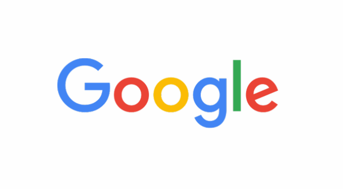
Hidden Message: A touch of green
At first look you might just see the name of the company written in colorful font with nothing fancy. But with the touch of green, Google conveyed the message o standing out from its basic color scheme which was red, yellow and blue.
Hence, Google gives a message of innovation and out of the box thinking.
Starbucks
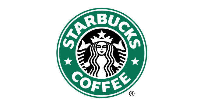
Hidden Message: The salty siren
Everybody knows that Starbucks volleys from Seattle, a city known for its seaport roots. When it came time to create a logo for the brand image, the creators end up choosing a symbol of the sea which made them feel close to sea. However, the appearance of the Starbucks siren has changed over time.
You can no longer see her naked breasts and the logo was recently redesigned so that the image of the siren is closely cropped.Ratings And Reviews For Best Products And Services - Virtuous Reviews LLP
Leave a Reply
Categories
-
A/B Testing and Personalization Tools
-
Affiliate Marketing
-
Auto Repairing
-
Bakery
-
Beer
-
Bike Insurance
-
Bill
-
Blood Banks
-
Bus
-
Buy
-
Car Designers
-
Car Insurance
-
Carpenters
-
Digital Cameras
-
Doctors
-
Fashion Designers
-
Fleet Management
-
Flowers
-
Freelancer Sites
-
Graphic Designers
-
Health
-
Hospitals
-
Hotel Management
-
Hotels
-
Internet Service Providers
-
Jewelry
-
Lawyer
-
Logo Designers
-
Masons
-
Mobile
-
Mobile Phones
-
New Cars
-
Online Courses
-
Packers & Movers
-
Pizzas
-
Rent
-
Scotch
-
Security Services
-
Sell
-
Sell Cars
-
SEO Services
-
Shoes
-
Tablets
-
Travel Insurance
-
Whiskey